


WORK TYPE: Personal Project
CD CASE SPECS: 5.59 '' x 4.29 ''
BOOKLET SPECS: 4.7 '' x 4.7 '', 32 pg
CD DISC SPECS: 4.7 ''
YEAR: 2023
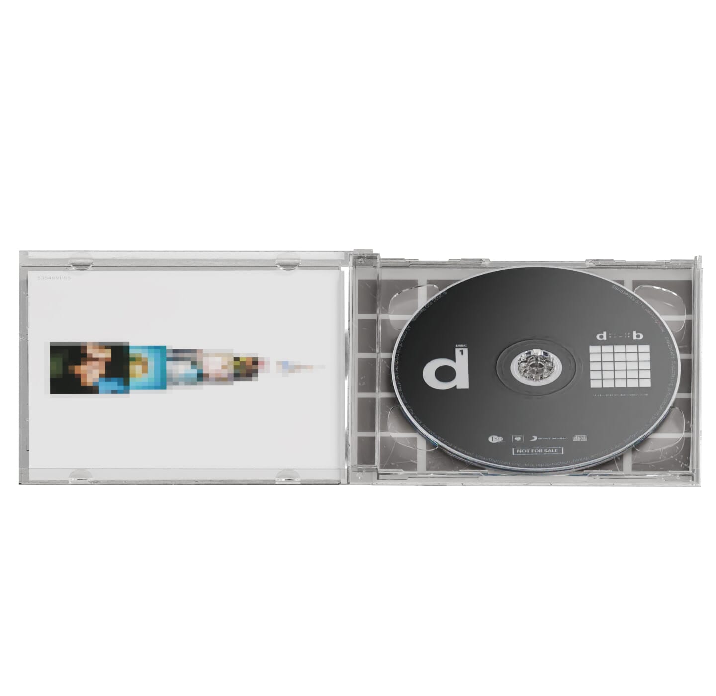
This was a personal project I worked on for myself. It is a double album CD for a conceptual David Bowie compilation album complete with a cover, booklet, tray card, and 2 discs that I designed.
Despite the declining popularity of CDs and physical media in general, I came up with this project idea because I always had a fascination with music packaging design and just how many small details and factors that goes into making these things that we overlook or take for granted.
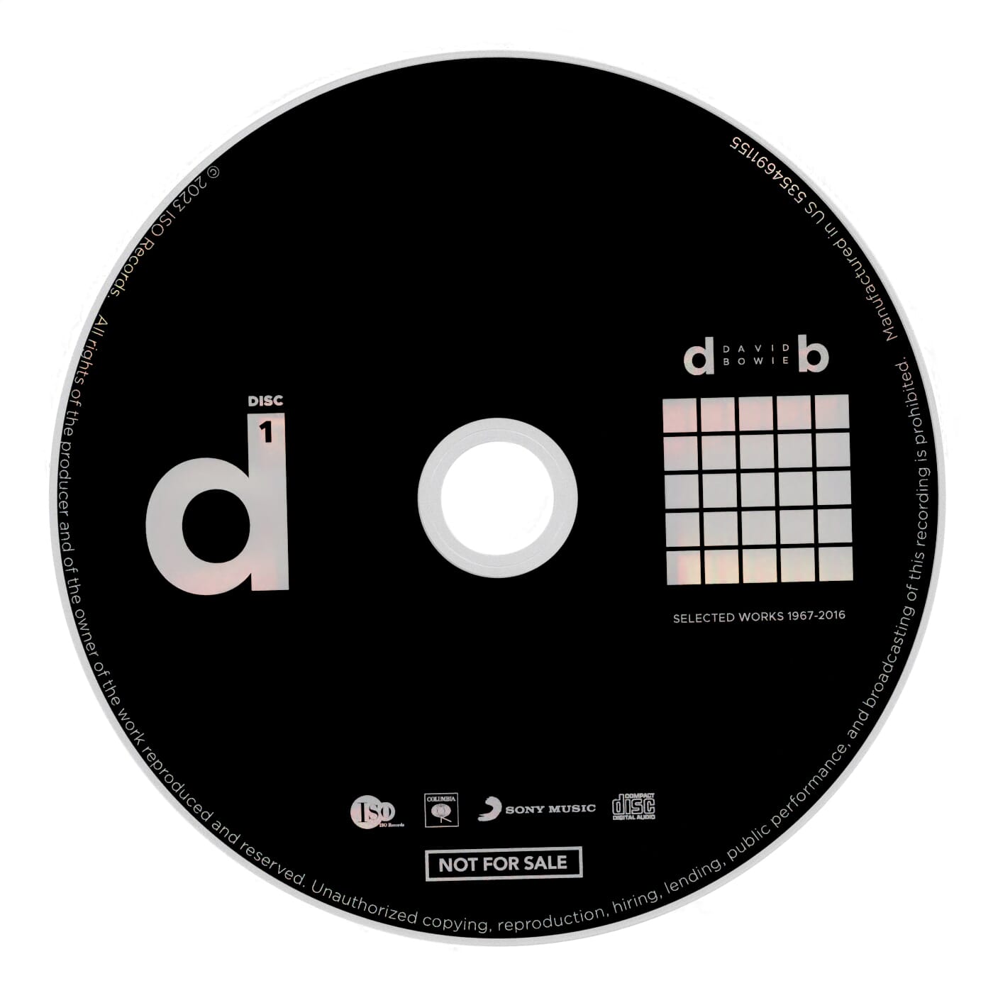
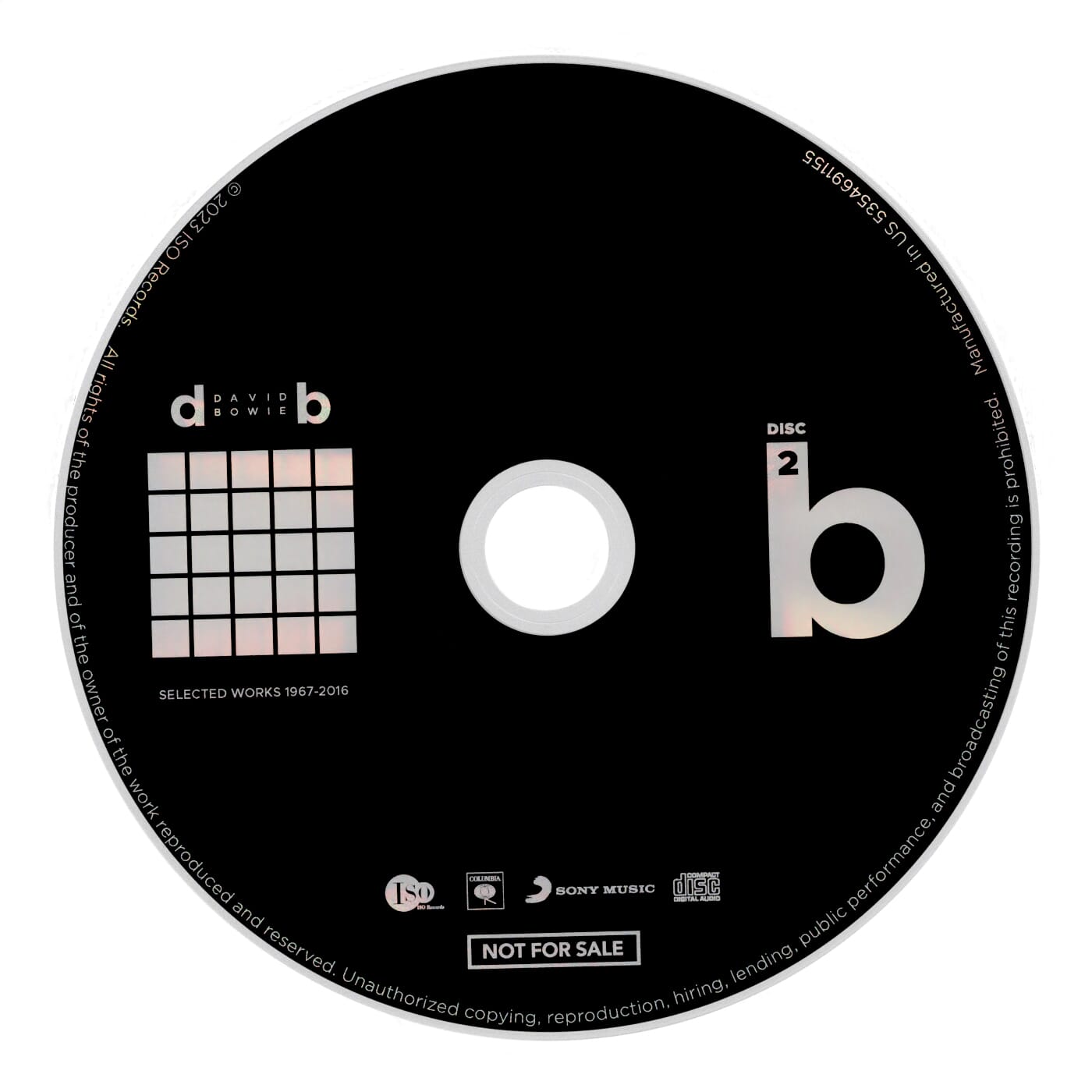
This conceptual David Bowie compilation album contains at least one hit song from all of his 26 standalone studio albums. I chose him as my subject for this project since he was the most prolific musician I could think of and a greatest hits album would’ve been easier to make than conceptualizing one from scratch. His discography is reflected through a 5x5 square grid that is displayed throughout the packaging’s design. The grid actually contains only 25 squares since I omitted The Buddha of Suburbia album from the cover artwork as it was his least popular album and I wanted to keep the logo nicely even in height and length. I integrated a song from that album with Black Tie White Noise that was both released the same year in 1993.
This album’s target audience would be for dedicated Bowie fans or curious listeners who would like to get a taste of his discography through his 45+ year career as a musician.
To rotate the interactive 360° spin model, hold the left button mouse on the model and drag it horizontally from left to right.
For the art direction of the album, I wanted to keep it moderately minimalistic. The cover artwork features the grid logo with each square representing his albums in chronological order. The artwork of the albums are simplified and scaled down to their color palette and swatches, giving it a pixelated, mosaic effect. They symbolize a retrospective, blurred view of his career. This style was inspired by Modernism. The gird is framed in a solid black square to contrast it with the white background. Much of the same concept applies with the back cover with the addition of important information like the track list, total time, legal info, etc.

Alongside the grid logo, I also used Bowie’s initials “DB” in lower case letters as design motifs since they work cohesively together and their letter forms are nearly symmetrical. This is reflected through the two discs, where side “d” represents disc 1, and side “b” represents disc 2.
As for the booklet, it contains informational things like lyrics, credits, etc. Each page with a song’s lyrics would feature an enlarged image of their album’s respective cover from the grid. The footnote of each song lyric page includes the chronological number in which the album was released as. The grid logo would also in the footnote also indicates the order of the albums through its tiles by the change of color in each page.
Below is an interactive 32-page PDF of the CD booklet. Use the slider below or drag your mouse cursor left and right to the pages to take a look.
To rotate the interactive 360° spin model, hold the left button mouse on the model and drag it horizontally from left to right.