
WORK TYPE: Class Assignment
SLEEVE BOX SPECS: 5.5 '' x 5.5 ''
MAGNETIC RIGID BOX SPECS: 5.2 '' x 5.2 ''
FRAGRANCE BOTTLE SPECS: 4.98 '' x 4.06 ''
YEAR: 2024
There are two boxes in this packaging set:
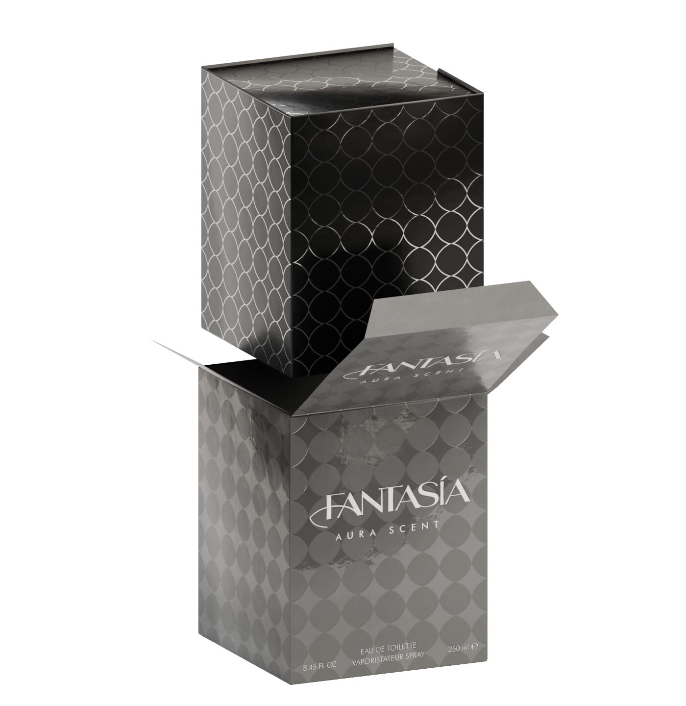
a lightweight box sleeve cover
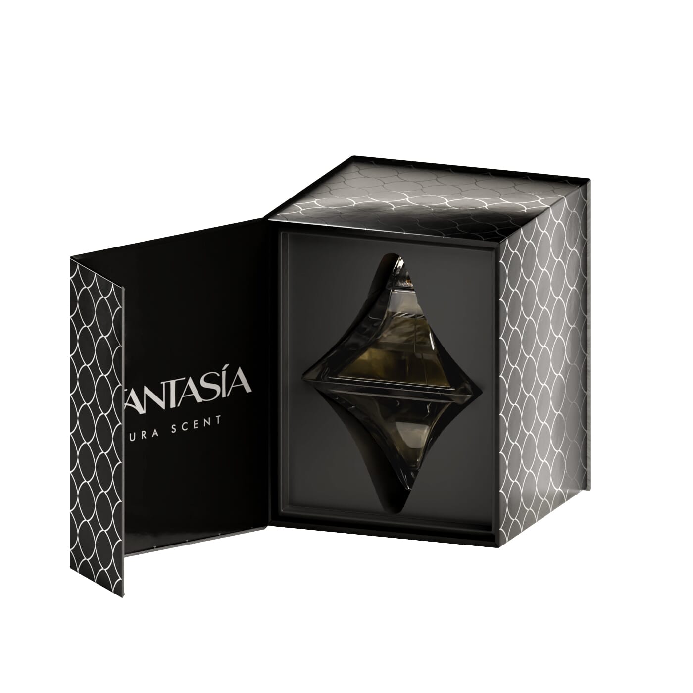
a magnetic rigid box that snuggly stores the perfume bottle with a plastic mold casting the bottle’s shape inside (so it won’t easily fall upon opening)
This ensures the security, practicality, and safety of the contents.
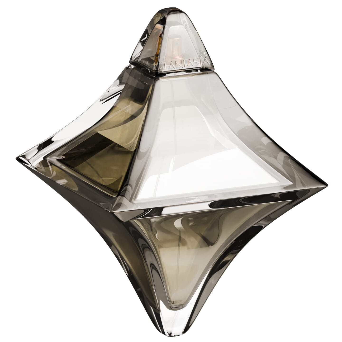
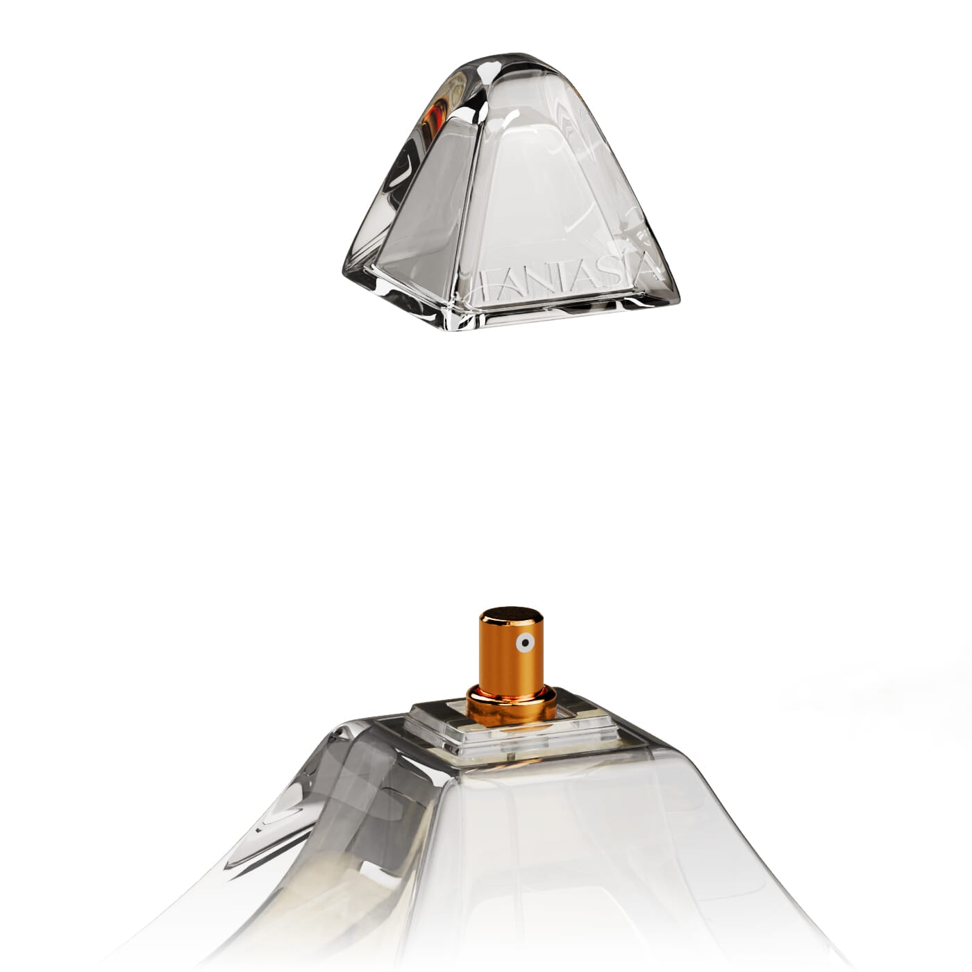
For the packaging design, I used an icon of a sparkle that serves as a visual motif. In both boxes, they’re aligned in a pattern on all of its sides. For the box sleeve cover, the pattern is shown as a solid, filled shape. For the magnetic rigid box, the pattern is inverted and it is shown as an outlined shape instead. The sparkle icon is also used for the perfume bottle’s shape design. The bottle was also designed and 3D modeled by me. It features an engraving of the brand’s wordmark logo.
There is a bit of emboss in the pattern of the boxes that gives the packaging depth. Through the 3D models, you can see that the pattern has a shiny, reflective texture As for the colors, it is dependent on the scent type. The “Aura” scent, as shown here, is represented by a grey color. The sleeve box is shown in a solid grey color while the magnetic rigid box maintains a black color but the pattern has a silver finish to it.
The perfume bottle’s color is also dependent on the scent too. For this scent, it’s a simple clear color. Shown below are variations of different scent types and colors. Also shown are the size measurements for product and concept sketches I made for this fictional brand and the ideation behind it.
This is a packaging design for a conceptual fragrance brand that I have created in my Graphic Design 2 class as an assignment. This project is just more than graphic design, it’s pretty much a whole product.
The world of fragrances, perfumes, and colognes is complex. There are thousands of brands out there with many different fashion designer names, scents types, and unique bottle designs. I chose not to name this brand after anyone in particular and decided to simply use a brand name that sounded fancy.
I used the Spanish word, fantasía, as the name for this brand. Not to be confused for the English word and pronunciation without the acute accent mark, this word means “fantasy” in Spanish. The typeface used for the wordmark logo is a modified version of Mondy Semi-Bold, with a more tapered and curved design in its characters. In addition, I added a stylized stroke in the crossbar of the first letter “A” of the wordmark logo to emphasize the elegance in its branding identity.
To rotate the interactive 360° spin model, hold the left button mouse on the model and drag it horizontally from left to right.


To rotate the interactive 360° spin model, hold the left button mouse on the model and drag it horizontally from left to right.


Concept sketches for the bottle and box's design. The box design went through quite a few iterations. Practicality and user experience were taken heavily into account. Sizing and measurements too. (Click to expand)
More concept sketches for the magnetic rigid box. The drawing on the right was ultimately chosen for the final design. (Click to expand)


